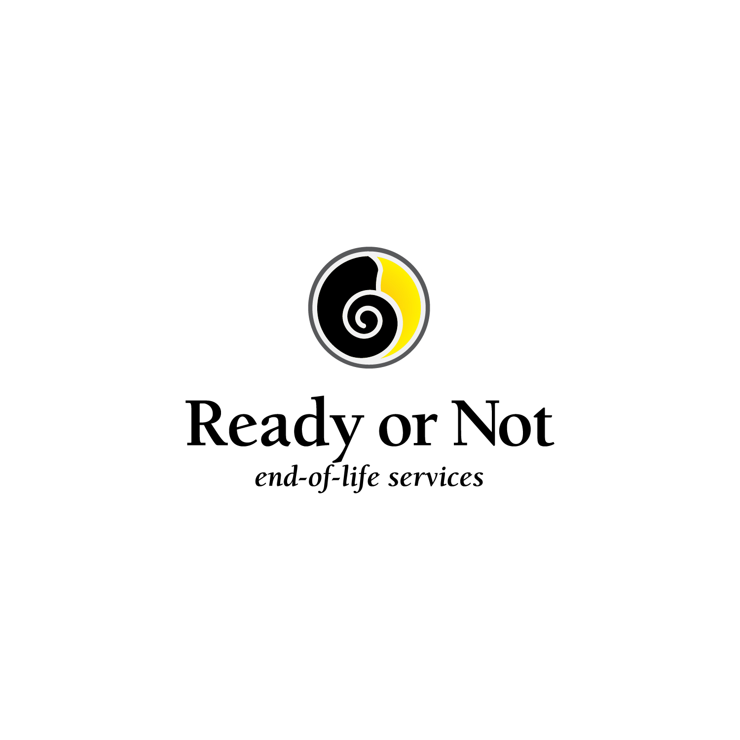
Symbolizing life and death
Ready or Not end-of-life services offers grief & bereavement counselling, community support, education, unique workshops & groups, ceremonies and rituals for navigating dying, death, bereavement & other non-death losses. Serving the Ottawa Valley.
Julie Keon came to me when she needed her business rebranded. She really connected with moon snail shells and the symbolism that is in the spiral in connection with her work around life and death. I designed the logo with simplicity in mind and uniting the organic within the perfect circle shape. The colours yellow and black symbolizing life and death.
Ready or Not end-of-life services’ website designed by Das Studio Designs.
It takes tremendous skill and a good helping of intuition to listen to a client’s mish-mash of ideas and vision and turn them into a work of art. When a logo clearly communicates the service or product, the graphics designer has fulfilled the task. However, when the logo has depth and meaningful subtleties, it has been born of an artist. Joanne Lesk is dedicated, intuitive and creative. She will sift through your needs, wants and goals, and turn them into something incredible. I can highly, and without hesitation, recommend Joanne for your graphics design needs.”
Julie Keon, Founder of Ready or Not end-of-life services

Let’s Work Together. Do you need help with your business’s visual identity? Contact me and let’s make your business awesome!